The Psychology Behind Great Logo Design
May 4, 2025
A great logo is more than just aesthetics — it’s a visual shortcut to what your brand stands for. Let’s explore the psychological principles that make logo design so powerful.
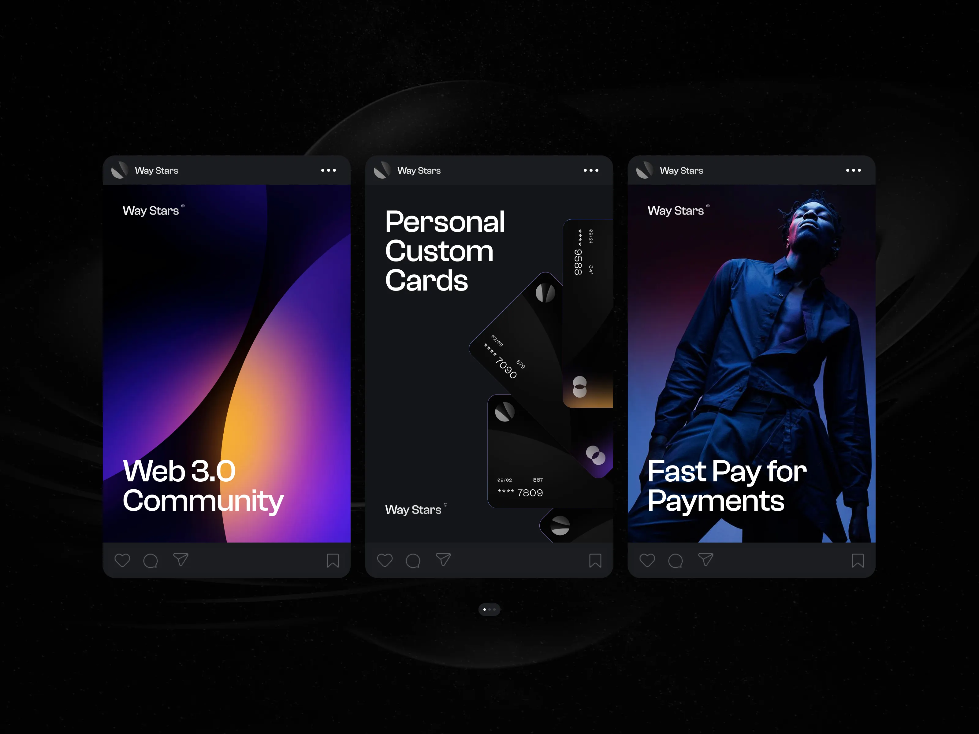
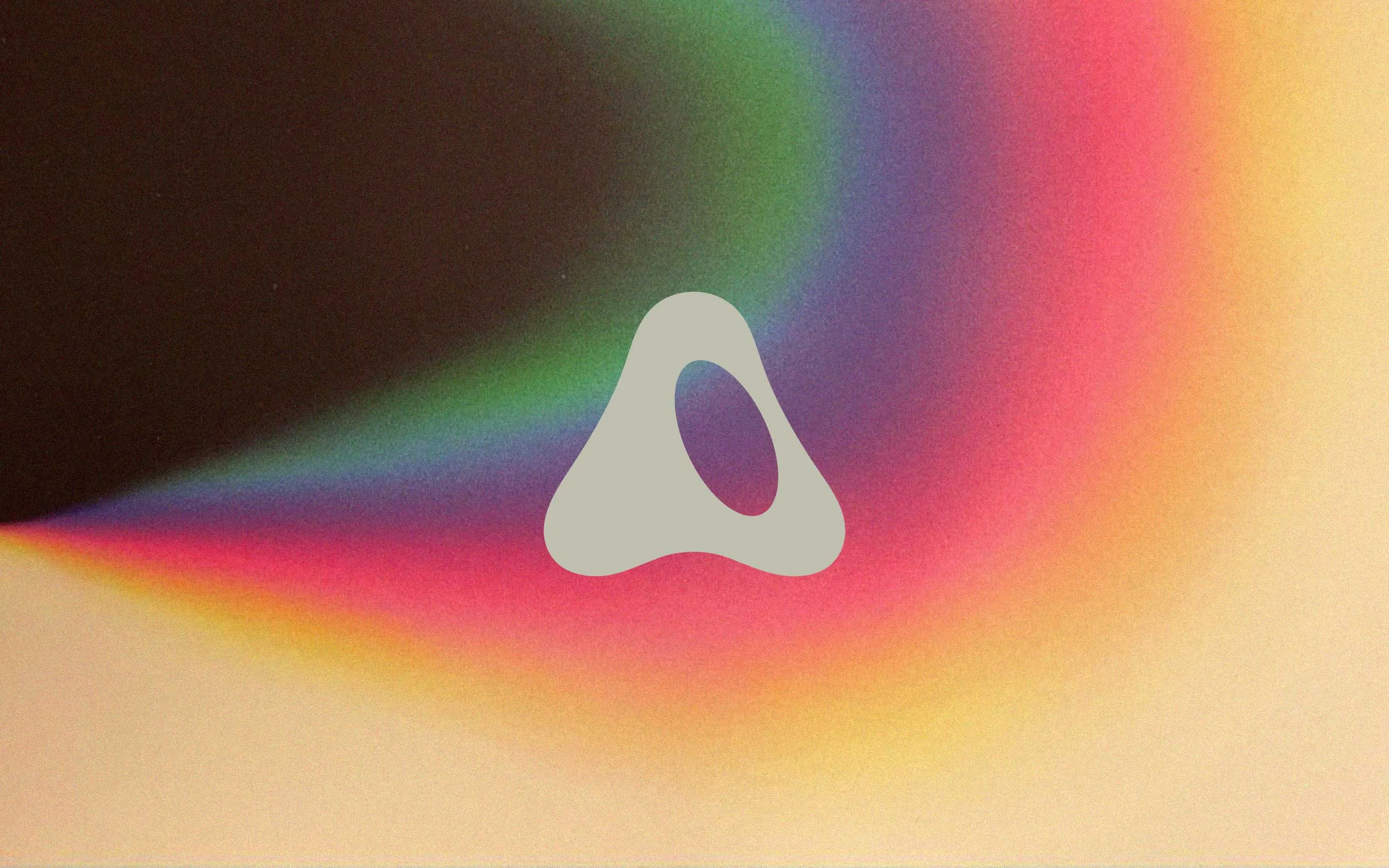
1. Shape Communicates Personality
Circles evoke unity, community, and harmony.
Squares and rectangles suggest stability and reliability.
Triangles convey power, direction, or innovation.
Choosing the right shape helps align the logo with your brand’s values and energy.
2. Color Triggers Emotion
Colors speak before words. Here’s what they commonly signal:
Red = excitement, passion, urgency
Blue = trust, professionalism, calm
Green = growth, health, sustainability
Black = luxury, sophistication, strength
Using color psychology strategically can influence how customers perceive your brand from the first glance.
3. Simplicity Aids Memory
Simple logos are easier to recognize and remember. Think of Apple or Nike — minimal elements, maximum impact.
4. Typography Matters
Fonts can be elegant, quirky, bold, or techy — and they set the tone. Serif fonts tend to feel classic and trustworthy, while sans-serif fonts are modern and clean.
5. Balance Builds Trust
A well-balanced logo feels polished and professional. Symmetry and alignment enhance visual harmony, which helps reinforce credibility.
Final Thought
The best logos are more than just beautiful — they’re backed by intention and psychology. Understanding how visuals affect emotion and perception is key to creating a logo that truly sticks.